
- Created by Silvan Frey on Sep 01, 2026 9 minute read
You have English selected as language but this page has not been translated yet. Translate the page or view the content in the default space language below.
Display defaultStarting with version 3.0.0 of the VicSDK, almost all customizations are made with the new VicSettings Builder class. Some features can be changed after initialization with VicSdk class.
Environment
You can set the environment for the VicSdk. The Environment defines, which Sasis Backend will be called, StageNext or Production. The default is set to production.
val vicSettings = VicSettings.Builder()
    					.setEnvironment(env = VicEnv.DEV)
    					// other builder methods
						.build()
The VicEnv is defined like this:
enum class VicEnv {
    DEV, PROD, STAGE
}
Language
In order to change the language of the VIC SDK, call the setLanguage(context: Context, language: VicLang, shouldRecreate: Boolean = false) method of the VicSdk class:
VicSdk.setLanguage(context, VicLang.DE)
The languages supported by the VIC SDK are: German, English, Italian, French.
enum class VicLang {
    DE, FR, EN, IT
}
The Context should be an Activity Context. The shouldRecreate flag determines whether or not the activity (context) should be recreated immediately for the language settings to take immediate effect.
— Attention — If the language of the SDK changes after the CardsActivity is created, the Activity must be recreated for the language change to take effect.
To pass the Language-Setting to the Base-Context of the Application, The method attachBaseContext has to be overriden in the CardsActivity with the LocaleHelper of the SDK.
override fun attachBaseContext(newBase: Context?) {
	super.attachBaseContext(newBase?.let{ VicLocaleHelper.onAttach(it) })
}
FontFamily
For customizing the text displayed by the VicSdk, you can set the Fonts using setFontFamily(vararg fonts: VicFont):
(Since 3.1.1 the old method setFontFamily(fontFamily: FontFamily) is deprecated, in favor of compose independence)
val fonts = arrayOf(
    VicFont(
        fontRes = ...,
        weight = ...,
        italic = ...
    ),
	...
)
val vicSettings = VicSettings.Builder()
                        .setFontFamily(fonts = fonts)
                        // other builder methods
						.build()
The VicFont has the following properties:
data class VicFont(
    @FontRes val fontRes: Int,
    val weight: Int = 400,
    val italic: Boolean = false,
)
Colors
To change appearance colors you can use the method setColorScheme(colors: VicColorScheme). Internally the VicSdk follows the Material 3 color scheme. You can set your colors as followed:
(Since 3.1.1 the old method setColorScheme(colorScheme: ColorScheme) is deprecated, in favor of compose independence)
val colorScheme = VicColorScheme(...)
val vicSettings = VicSettings.Builder()
                        .setColorScheme(colors = colorScheme)
                        // other builder methods
						.build()
The VicColorScheme has the following properties:
data class VicColorScheme(
    @ColorInt val primary: Int? = null,
    @ColorInt val onPrimary: Int? = null,
    @ColorInt val primaryContainer: Int? = null,
    @ColorInt val onPrimaryContainer: Int? = null,
    @ColorInt val inversePrimary: Int? = null,
    @ColorInt val secondary: Int? = null,
    @ColorInt val onSecondary: Int? = null,
    @ColorInt val secondaryContainer: Int? = null,
    @ColorInt val onSecondaryContainer: Int? = null,
    @ColorInt val tertiary: Int? = null,
    @ColorInt val onTertiary: Int? = null,
    @ColorInt val tertiaryContainer: Int? = null,
    @ColorInt val onTertiaryContainer: Int? = null,
    @ColorInt val background: Int? = null,
    @ColorInt val onBackground: Int? = null,
    @ColorInt val surface: Int? = null,
    @ColorInt val onSurface: Int? = null,
    @ColorInt val surfaceVariant: Int? = null,
    @ColorInt val onSurfaceVariant: Int? = null,
    @ColorInt val surfaceTint: Int? = null,
    @ColorInt val inverseSurface: Int? = null,
    @ColorInt val inverseOnSurface: Int? = null,
    @ColorInt val error: Int? = null,
    @ColorInt val onError: Int? = null,
    @ColorInt val errorContainer: Int? = null,
    @ColorInt val onErrorContainer: Int? = null,
    @ColorInt val outline: Int? = null,
    @ColorInt val outlineVariant: Int? = null,
    @ColorInt val scrim: Int? = null,
    @ColorInt val surfaceBright: Int? = null,
    @ColorInt val surfaceDim: Int? = null,
    @ColorInt val surfaceContainer: Int? = null,
    @ColorInt val surfaceContainerHigh: Int? = null,
    @ColorInt val surfaceContainerHighest: Int? = null,
    @ColorInt val surfaceContainerLow: Int? = null,
    @ColorInt val surfaceContainerLowest: Int? = null,
)
Button colors (since v3.0.2)
Button colors for the different button styles can be customized by setting setButtonColors(type: VicButtonColors, colors: VicButtonColorConfig) (since 3.1.1):
(Since 3.1.1 the old method setButtonColor(vicButtonColors: VicButtonColors, buttonColors: ButtonColors) is deprecated, in favor of compose independence)
val vicSettings = VicSettings.Builder()
                        .setButtonColor(
							vicButtonColors = VicButtonColors.PRIMARY,
							buttonColors = VicButtonColorConfig(
								container = ...,
                    			content = ...,
                    			disabledContainer = ...,
                    			disabledContent = ...
							)
                        )
                        // other builder methods
						.build()
The VicButtonColors is defined like this:
enum class VicButtonColors {
    PRIMARY, PRIMARY_INVERTED, SECONDARY, SECONDARY_INVERTED
}
TheVicButtonColorConfig is defined like this:
data class VicButtonColorConfig(
    @ColorInt val container: Int,
    @ColorInt val content: Int,
    @ColorInt val disabledContainer: Int? = null,
    @ColorInt val disabledContent: Int? = null,
)
Dimensions
There are 4 dimension tokens that can be customized. These can be set with setDimensionToken(vicDimenToken: VicDimenTokens, tokenValueDp: Float):
(Since 3.1.1 the old method setDimensionToken(vicDimenToken: VicDimenTokens, tokenValue: Dp) is deprecated, in favor of compose independence)
val vicSettings = VicSettings.Builder()
                        .setDimensionToken(vicDimenToken = VicDimenTokens.BUTTON_BORDER_RADIUS, tokenValue: 4.0f)
                        // other builder methods
						.build()
The VicTutorialScreen is defined like this:
enum class VicDimenTokens {
    BUTTON_BORDER_RADIUS, BUTTON_BORDER_WIDTH, CARD_BORDER_RADIUS, CARD_BORDER_WIDTH
}
Text styles
The text styles of the text fields can be customized by setting a separate TextStyle for each of them by using setTextStyle(vicTextStyles: VicTextStyles, vicTextStyleConfig: VicTextStyleConfig)
(since v3.0.2, the old method setTextStyle(vicTextStyles: VicTextStyles ,textStyle: TextStyle), and since 3.1.1 the old setTextStyle(vicTextStyles: VicTextStyles, vicTextStyle: VicTextStyle) are deprecated, in favor of compose independence):
val textStyle = TextStyle(
    fontSize = 24.sp,
	color: Color.Gray
)
val vicSettings = VicSettings.Builder()
                        .setTextStyle(
							vicTextStyles = VicTextStyles.PAGE_TITLE,
                            vicTextStyleConfig = VicTextStyleConfig(...)
						)
                        // other builder methods
						.build()
The following text fields can be customized (defined in VicTextStyles):
enum class VicTextStyles {
    PAGE_TITLE,
    INVERTED_PAGE_TITLE,
    SUBHEAD,
    COPYTEXT,
    BOLD_COPYTEXT,
    INVERTED_COPYTEXT,
    NOTIFICATION_BANNER,
    ERROR_BANNER,
    CARD_TITLE,
    CARD_OVERVIEW_INSURED,
    CARD_OVERVIEW_EXPIRYDATE,
    CARD_OVERVIEW_EXPIRED,
    CARD_INSURED,
    CARD_FRONT_LABEL,
    CARD_FRONT_VALUE,
	CARD_FRONT_DESCRIPTION, // since v3.0.2
    BUTTON_PRIMARY,
    BUTTON_PRIMARY_INVERTED,
    BUTTON_SECONDARY,
    BUTTON_SECONDARY_INVERTED
}
The VicTutorialScreen is defined like this:
data class VicTextStyleConfig(
    val fontSizeSp: Float? = null,
    val lineHeightSp: Float? = null,
    val letterSpacingSp: Float? = null,
    val fontWeight: Int? = null,
    @ColorInt val color: Int? = null,
    @FontRes val fontFamilyRes: Int? = null,
    val uppercase: Boolean = false
)
Tutorial screens
With the method setTutorialScreens(screens: List<VicTutorialScreen>) you can define, which tutorial screens should be shown to the user. An empty List disabled the tutorial. Defaults to all screens from the enum:
val vicSettings = VicSettings.Builder()
                        .setTutorialScreens(screens = listOf(VicTutorialScreen.WELCOME_SCREEN, VicTutorialScreen.QR_CODE_SCREEN, ...))
                        // other builder methods
						.build()
The VicTutorialScreen is defined like this:
enum class VicTutorialScreen {
    WELCOME_SCREEN, QR_CODE_SCREEN, BARCODE_SCREEN, NFC_SCREEN, BACK_OF_CARD_SCREEN
}
Card-Data
On the Front Card, by default, card data attributes in following order are shown:
CARD_NUMBER, BAG_NUMBER, AHV_NUMBER, BIRTHDATE, EXPIRY_DATE, BARCODE, WALLET
The visibility and order of those attributes can be changed by using setCardListItems(cardListItems: List<VicCardListItem>):
val vicSettings = VicSettings.Builder()
                        .setCardListItems(cardListItems = listOf(VicCardListItem.CARD_NUMBER, VicCardListItem.BAG_NUMBER, ...))
                        // other builder methods
						.build()
The VicTutorialScreen is defined like this:
enum class VicCardListItem {
    CARD_NUMBER, BAG_NUMBER, AHV_NUMBER, BIRTHDATE, EXPIRY_DATE, BARCODE, POLICY_HOLDER, WALLET
}
Card customization
To customize card by type or cardNumber, you have the following options:
(Since 3.1.1 VicCardConfig, setCardDefaultConfigKVG(cardConfig: VicCardConfig) and setCardDefaultConfigVVG(cardConfig: VicCardConfig) are deprecated, in favor of compose independence)
- Setting default card config with setCardDefaultConfigKVG(cardStyle: VicCardStyle) and setCardDefaultConfigVVG(cardStyle: VicCardStyle)VicSettings Builder - setCardDefaultConfigurationKVG() / setCardDefaultConfigurationVVG()
val vicSettings = VicSettings.Builder()
                        .setCardDefaultConfigKVG(cardStyle = VicCardStyle(...))
						.setCardDefaultConfigVVG(cardStyle = VicCardStyle(...))
                        // other builder methods
						.build()
- Setting runtime configurations per card after the SDK is initialized with VicSdk.configureCard(cardNumber: String, cardStyle: VicCardStyle)VicSdk - configureCard()
VicSdk.configureCard(
    cardNumber = "80756012340000000033",
    config = VicCardStyle(
        cardFrontImageRes = R.drawable.card_view_kvg_premium_background,
        textColor = "#FFFFFF",
        secondaryTextColor = "#CF0415",
    )
)
The VicCardConfig has the following optional properties:
data class VicCardStyle(
    @DrawableRes val cardFrontImageRes: Int? = null,
    @DrawableRes val cardBackImageResVVG: Int? = null,
    val textColor: String? = null,
    val secondaryTextColor: String? = null,
    val freeFieldText: String? = null,
    val freeFieldTextStyleVVG: VicTextStyleConfig? = null,
    val hideMagneticStrip: Boolean? = null
)
Rules for configuration
- If a VicCardConfig for a card exists and the property is set, this value is used.
- If no VicCardConfig for a card exists or the property is not set, the value is looked up in the corresponding default config for the specific card type
- If no default config is available, or the property isn't set in the default config, SDK defaults will be used.
→ default image background for the front image is:
→ default background for back image is white
→ default color for the colors is: "#000000"
→ default string for the strings is: ""
Background images
- The card image should have a form factor of 1:1.73 e.g.: 945x546 pixel.
- The logo is to be placed in the right half of the image
- The logo must be horizontally right aligned and vertically centered.
- The maximum size of the logo is 70% width and 60% height of the total image.
Complementary Card Backside
Showing the backside of complementary cards can be enabled/disabled (per insurance not per card). Default: enabled. To disable use
val vicSettings = VicSettings.Builder()
                        .setShowComplementaryCardBackside(showComplementaryCardBackside = false)
                        // other builder methods
						.build()
This disables the rotation when clicking on the card frontside and also hides the rotation button
Card Backside English
The european backside of cards can be shown in English regardless of the language set for the app.
Default: false. To set English as default for the backside use
val vicSettings = VicSettings.Builder()
                        .setEnglishEuropeanCardEnabled(enabled = true)
                        // other builder methods
						.build()
Policy Number Label Alternative
The label of the policy number can show an alternative text. The alternative texts are as following:
- EN: Insured person no.
- DE: Versicherten-Nr.
- FR: N° d’assuré(e)
- IT: Numero d’assicurato
Default: false. To use the alternative labels use
val vicSettings = VicSettings.Builder()
                        .setUseAlternativeLabelForPolicyNumber(enabled = true)
                        // other builder methods
						.build()
Wallet
From version 3.0.0 of the VicSdk, the SDK supports Google Wallet integration.
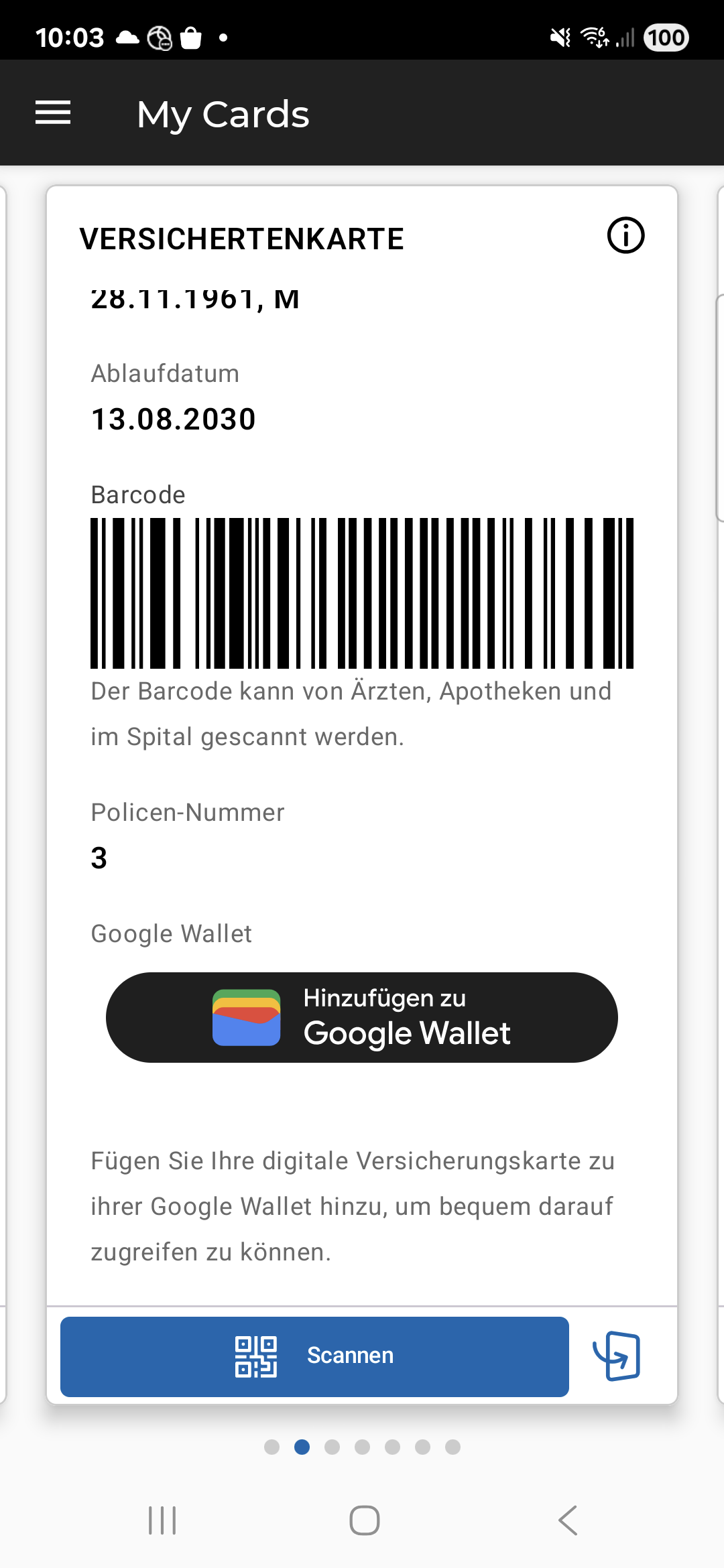
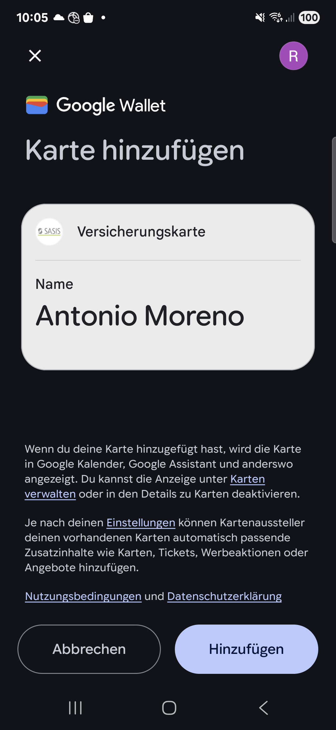
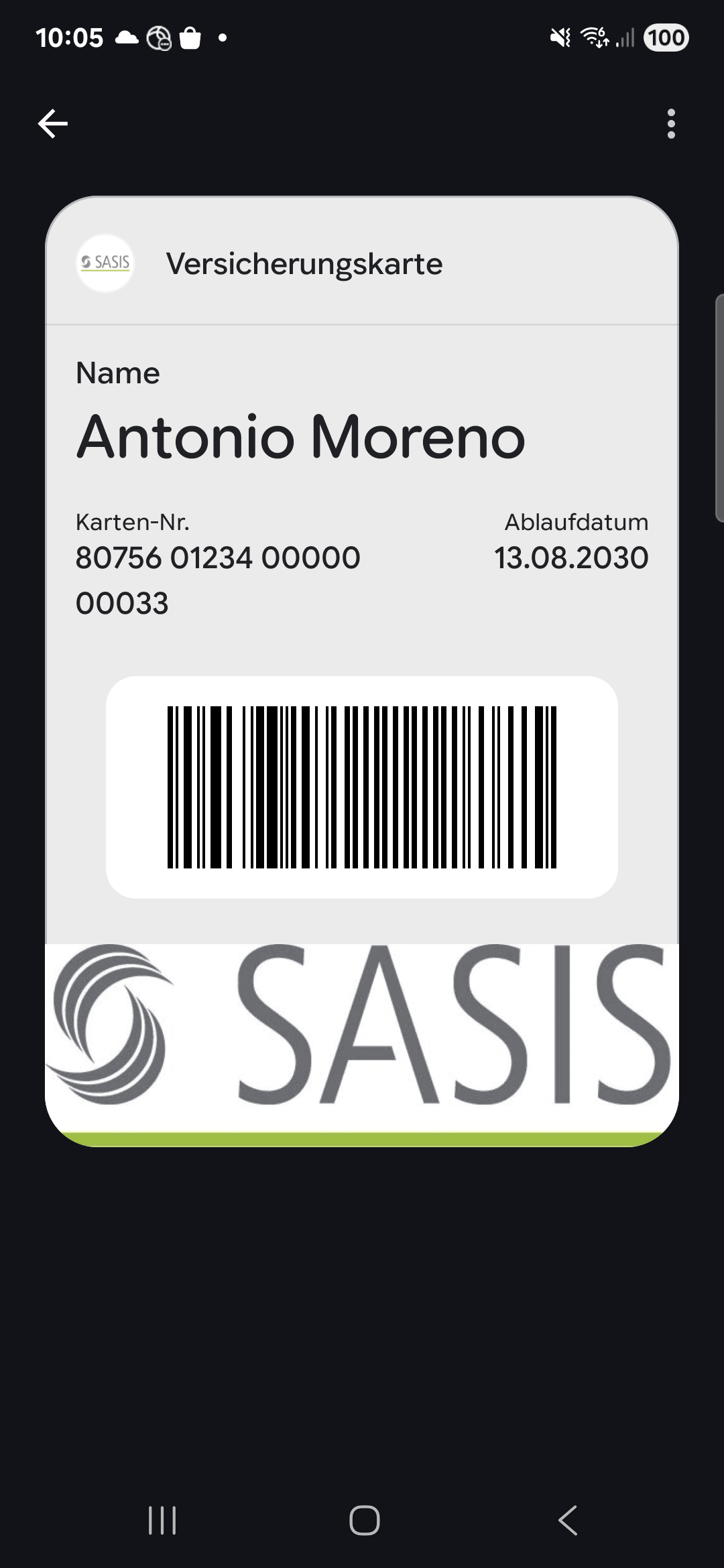
When adding the card to Google Wallet the signing of the Wallet Pass is done via the Sasis backend.
To enable Google Wallet integration, you have to set the VicWalletConfig. This can be done with setWalletConfiguration(walletConfig: VicWalletConfig) as global configuration:
val vicSettings = VicSettings.Builder()
                        .setWalletConfiguration(
							walletConfig = VicWalletConfig(
							    logoUrl = "https://...",
                    			heroImageUrl = "https://...",
                    			backgroundColor = "#FF0000"
							)
						)
                        // other builder methods
						.build()
Setting runtime configurations per card after the SDK is initialized with VicSdk.configureCardWallet(cardNumber: String, walletConfig: VicWalletConfig)
VicSdk.configureCardWallet(
    cardNumber = "80756012340000000033",
    config = VicWalletConfig(
		logoUrl = "https://...",
        heroImageUrl = "https://...",
        backgroundColor = "#FF0000"
	)
)
The exact sizes and formats are defined by Google and can be found here: Google Wallet brand guidelines
If no config is set, or the users phone doesn't support Google Wallet, the wallet button will stay hidden.
The VicWalletConfig has the following optional properties:
data class VicWalletConfig(
    val logoUrl: String,
    val heroImageUrl: String,
    val backgroundColor: String = "#ebebeb"
)
- No labels